
Views: 0 Author: Site Editor Publish Time: 2026-08-16 Origin: Site


Black sofas offer unmatched durability and a visually striking presence. However, they easily act as a "black hole" for light if you do not style them correctly. We see many homeowners struggle when designing around dark furniture. Selecting the perfect wall colors, textiles, and complementary furniture is crucial for balance. This careful selection prevents the room from feeling cramped, cold, or sterile. A well-designed space must balance heavy seating against lighter architectural elements seamlessly.
This comprehensive guide provides a clear evaluation framework for your home. You will learn how to choose a beautiful living room color with a black sofa confidently. We will explore how to balance natural light, material textures, and spatial dimensions effectively. You can easily transform your space into a welcoming, well-proportioned sanctuary by following these proven design principles.
Contrast is non-negotiable: Pairing a black sofa with medium-to-light wall colors prevents visual shrinking of the room.
Material sheen matters: A matte fabric sofa absorbs light, requiring brighter accent colors, while a black leather sofa reflects light, allowing for richer, moodier palettes.
Furniture bridges the gap: Strategic use of wood, glass, or metallic coffee tables and side tables softens the heavy visual footprint of black seating.
Light dictates palette: North-facing rooms require warm undertones to counteract cool natural light, whereas South-facing rooms can handle cooler, high-contrast schemes.
Large dark furniture anchors a room instantly. However, the physics of black furniture demand strict lighting and color counterbalances. Dark shades absorb visible light rays. If you place large Living Room Sofas in a dim space, the surrounding area feels significantly smaller. Visual weight refers to how much an object draws the eye. Black upholstery carries maximum visual weight.
We rely on standard design frameworks to manage this heavy visual footprint. You must establish specific success criteria for your color selection.
Light Reflectance Value (LRV): Paint manufacturers use LRV to measure how much light a color reflects. We recommend aiming for an LRV of 50 or higher on primary walls. This maintains adequate room brightness.
The 60-30-10 Rule: This classic formula ensures balanced proportions. Dedicate 60% of the room to your dominant wall color. Assign 30% to secondary colors like rugs or accent chairs. Leave the final 10% for black elements, including the sofa and minor accents.
Designers often see homeowners fall into predictable traps. Avoid using high-contrast stark white paint without incorporating transitional middle tones. Extreme contrast causes rapid eye strain. Furthermore, neglecting your floor color integration often ruins the aesthetic. Dark hardwood floors paired directly below a black sofa will erase the furniture's silhouette completely.
Light Reflectance Value Guidelines for Dark Furniture
LRV Range | Light Behavior | Best Application | Visual Effect |
|---|---|---|---|
0 - 29 | Absorbs most light | Accent walls, small trims | Moody, dramatic, potentially shrinking |
30 - 49 | Absorbs moderate light | Well-lit rooms, textiles | Cozy, rich, requires good lighting |
50 - 100 | Reflects most light | Primary walls, ceilings | Spacious, airy, balances dark sofas |
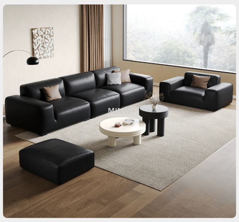
Choosing the right palette dictates the entire atmosphere of your home. We have compiled eight proven schemes. Each scheme balances the visual gravity of dark upholstery effectively.
Warm neutrals effortlessly soften the severity of dark furniture. They provide a gentle transition for the eye. This approach avoids the harshness of pure white.
To execute this look, layer ivory, beige, and taupe across the room. Paint your walls a soft cream. You should use heavily textured rugs to bridge the upholstery and light floors. Bouclé throw pillows in oatmeal shades create immediate visual warmth. It remains our most foolproof recommendation for any architectural style.
Earth tones introduce necessary natural warmth into modern spaces. This scheme proves highly effective in rooms featuring organic textures. It connects indoor spaces to outdoor environments seamlessly.
Incorporate rust, burnt sienna, and muted clay. Apply terracotta to an accent wall or through large area rugs. This palette pairs exceptionally well with natural wood accents. We suggest adding large indoor plants to complete this organic grounding strategy.
Darker rooms create a seamless, high-end architectural feel. A monochromatic palette blurs the edges of the room. It makes the black sofa blend into its surroundings elegantly.
However, this strategy carries a significant risk factor. It requires abundant natural light. You must also implement layered architectural lighting. Without proper lighting, the room easily develops a cave-like atmosphere. Use matte slate walls and glossy black accents to add necessary depth.
Green acts as a fantastic neutral against dark upholstery. It pulls the eye outdoors and promotes relaxation. Biophilic design principles rely heavily on these muted green shades.
Apply low-saturation sage greens on your primary walls. Olive green works beautifully for secondary upholstery like accent chairs. You should introduce brass or gold hardware on surrounding furniture. The metallic warmth contrasts the cool green perfectly.
This scheme emphasizes clean lines and strict minimalism. It highlights the silhouette of your seating perfectly. Galleries and modern lofts utilize this high-contrast approach frequently.
Execution requires careful material planning. You must incorporate varied textures to prevent a sterile, corporate lobby feel. Use linen drapery, matte metal fixtures, and textured art. These elements break up flat surfaces. They add human warmth to an otherwise rigid color scheme.
Jewel tones provide profound depth and undeniable elegance. Deep saturation holds its own against dark seating. These colors do not compete for dominance; they collaborate.
This scheme is best applied as an accent wall or via heavy drapery. Paint entire rooms in emerald only if you have massive windows. The execution requires warm artificial lighting. Aim for 2700K bulbs to highlight the rich undertones of the jewel colors during evening hours.
Blush pink offers the lowest-contrast approach to breaking up harsh lines. It creates a surprisingly sophisticated, adult space. It removes any masculine heaviness associated with dark furniture.
Use dusty rose or muted peach paints. Pair these soft walls with copper or brushed brass lighting fixtures. The pink undertones warm up the room instantly. It leaves the space feeling inviting, gentle, and highly curated.
This palette delivers high-energy contrast. It leverages complementary color theory brilliantly. Mid-century modern design relies heavily on this specific vibrant combination.
Keep your primary walls relatively neutral, preferably off-white. Inject these vibrant colors through accent chairs, decorative pillows, and oversized art. The vibrant orange and yellow tones draw attention away from the heavy sofa. They keep the eye moving continuously around the room.
The material of your sofa dictates how colors behave around it. Sheen determines light reflection. You must adapt your paint choices based on the upholstery material.
Black Leather Sofa Realities: Leather features a high sheen that reflects ambient light. While this helps brighten the piece slightly, it can look cold or commercial. A Black Leather Sofa demands specific styling to feel cozy. We recommend pairing it with matte wall paints, such as flat or eggshell finishes. You must also introduce highly textured, warm-colored textiles. Chunky knit throws and thick wool rugs absorb sound perfectly. They soften the glossy surface of the leather.
Black Fabric/Velvet Sofas: Fabric surfaces are completely matte. They absorb light aggressively. They can look flat, heavy, or dusty if left unstyled. We suggest pairing fabric upholstery with paints that have a subtle sheen, like satin. You should use high-contrast, bright accent pillows. These pillows create necessary visual separation between the dark fabric and the rest of the room.
Complementary furniture connects your sofa to your chosen wall color. Your tables act as a visual bridge. Selecting the wrong materials will disrupt the entire room's flow.
Wood Tones (Walnut, Oak, Teak): Wood adds essential warmth and organic variation. Light oak brightens the space immediately. It lifts the heavy visual weight of the seating. Walnut adds mid-century sophistication and pairs wonderfully with earth tones.
Glass and Acrylic: Transparent materials reduce visual clutter efficiently. A glass piece allows your rug color to show through clearly. This transparency prevents the seating area from feeling too boxed in or visually heavy.
Metals (Brass, Bronze, Matte Black): Metallic finishes introduce refined details. Brass or gold Side Tables pop brilliantly against dark upholstery. They add instant glamour. Using matte black legs on your Coffee Tables ties the room together. It references the sofa color without overwhelming the selected wall paint.
Implementation Warning: Avoid dark, bulky espresso-wood tables at all costs. They will merge visually with the dark upholstery. This mistake creates a massive "black hole" effect on your floor plan.
Never choose a paint color inside a hardware store. Lighting conditions vary drastically. You must evaluate your specific environment before purchasing gallons of paint. Follow these three critical steps.
Step 1: Audit Natural Light Exposure
Identify the primary direction your windows face. North-facing rooms receive cool, bluish light throughout the day. You must use warm-toned schemes like Earth Tones or Creams to combat this chill. South-facing rooms receive bright, warm sunlight constantly. These spaces can handle cooler tones comfortably, including Crisp White, Slate, or Sage.
Step 2: Factor in Existing Flooring
Flooring acts as your fifth wall. It impacts the room's brightness heavily. Dark floors paired with dark seating require an intervention. You need a light, oversized area rug to act as a visual buffer. Establish this buffer before you even apply wall color.
Step 3: Test Swatches Against the Upholstery
Undertones shift throughout the day. Paint swatches must be evaluated directly behind the sofa. Check them in the morning, afternoon, and evening. This 24-hour verification ensures the paint's undertone remains compatible under both natural and artificial light.
Achieving the perfect living room color with a black sofa is highly rewarding. Success relies entirely on balancing light reflectance, texture, and visual weight. You can transform a heavy piece of furniture into a sophisticated focal point effortlessly. Remember to leverage contrasting tones to prevent visual shrinking. Soften the room using organic textures and metallic accents.
We recommend a low-risk next step to begin your transformation. Purchase peel-and-stick paint samples of your top three preferred color schemes. Evaluate them against your sofa for at least 48 hours. Finally, assess your current complementary furniture. Check if your tables and rugs need updating to bridge your brand-new color palette effectively.
A: Not inherently. The room feels smaller only if the surrounding walls and floors lack sufficient light reflectance. If your layout blocks natural light pathways, the room will shrink visually. Proper lighting and light-colored walls easily counteract this effect.
A: Light-to-medium grays and vintage distressed creams work best. Bold geometric patterns that incorporate a small amount of black alongside lighter tones also look fantastic. You should avoid solid black or very dark brown rugs entirely.
A: Yes, but you must plan carefully. You must ensure the room has layered lighting, including ambient, task, and accent fixtures. Incorporate reflective materials like mirrors, glass tables, and metallic accents to prevent the space from feeling completely devoid of light.


